Level Design in World's Hardest Platformer 2
> Published on June 8th 2014 • 1254 words • 7 min read
Summary:
- More levels with smaller difficulty progression
- Hell World for advanced players to jump to
- Keep levels small
- Don’t force constraints on level designers
- Don’t group similar levels together
- Focus on “fun”. Playtest the levels and remove the least fun ones
- **Arrange levels based on difficulty, which is best defined by Time and Deaths relative to other levels
- Design levels manually
- Have a level editor
- Level designing takes a lot of time
We designed all 200 levels of World’s Hardest Platformer 2 by hand. By manually making every single level ourselves, we were able to make sure that they were all high-quality. In this article, I will discuss the design choices we took in the game and the reasons why..
Benefits of having a large amount of levels
In the first World’s Hardest Platformer, we noticed that there was a huge amount of players that couldn’t get past World 1. The game started out pretty easy, but as they advanced, they got stuck and just gave up. After much analysis, we attributed this problem to level difficulty progression being too high. Since WHP1 only had 32 levels and that we wanted the final levels to be very challenging, the difficulty “curve” was very steep. In WHP2, we solved this problem by having much more levels with a much slower difficulty progression. Worse players now had much more levels suited for them as much as much more practice, and more advanced players had much more harder levels to play. This system allows players to get better at the same pace as the game gets harder, so players never feel bored (that the game is too easy) or frustrated (that the game is too hard). A win-win for everyone.
The hell worlds
Having 200 levels solved the level progression problem, but it created a problem of its own: hardcore players now had to play through all the easy stuff before they could access the challenge that they were promised. This is where Hell World comes in. The Hell Worlds let “hardcore” players skip the easy tutorial stuff and go straight to the challenge. The requirements of unlocking Hell World was to achieve 3/3 Stars for each level in its normal counterpart. Achieving 3/3 Stars was much more challenging than just finishing the level, but it was optional, so that’s another win-win for both beginners and advanced players. Credit where credit is due, this system as well as the design choice on why we used is pretty much inspired by Super Meat Boy’s Dark World
Keeping levels small
The creator of Super Meat Boy already wrote an article on this so I don’t have to:
First off it was very important that the levels in Super Meat Boy be bite sized, you could almost think of most of them as micro levels, thrown at the player in rapid succession much like the micro games in the Wario Ware series. If we keep the levels small enough for the player to see their goal, it lowers the stress of not knowing what's to come and the distance they will have to start over from if they die.”
Edmund McMillen
To add on to that, in a game called World’s Hardest Platformer 2, players will die. And they will die a lot. So it’s important that they don’t feel like they lost much.
Our level design process
In our very first week of designing levels, we wanted each World to introduce some mechanic so players don’t feel overwhelmed. For example, World 2 introducing the Speed Tile and the Slow Tile, then World 3 introducing the Sinusoidal Cannon, etc. Makes perfect sense, right? Bzzz- — WRONG! There’s several reasons why this is bad and why we stopped doing this.
- It hinders creative design. Forcing designers to use a specific mechanic at a specific difficulty 5 times in a row just directly leads to uncreative and bad levels.
- It takes too long to introduce everything. WHP2 had so many mechanics and different tiles that players had to get to World 6 or 7 before they experience everything! That means that most players probably won’t even get to see everything!
- It makes levels boring to the player. Players are going to be bored if they play the same thing over and over again. It’s also a lot less of a surprise to them if they notice the patterns and are able to predict what the next level would be like.
We instead switched to just letting our designers make whatever the heck they wanted to and then rearranging the levels based on their difficulty. But how exactly do you define “difficulty”?
Defining difficulty
As said in the beginning, level design is an art and not a science, and you can’t just assign a value to each cannon and have a mathematical formula for difficulty. Instead, we based difficulty on time and deaths it took for people to complete a level relative to other levels. Neither are a perfect representation, since longer levels will clearly take a longer time than a short level regardless of difficulty, and that having more deaths doesn’t necessarily mean that a level was harder. However, taking account those two factors allowed us to get an approximate ranking of a level compared to other levels.
Iterations to ensure that levels are fun
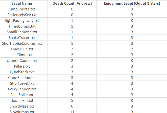
The most important thing in a level, in our opinions, is the fun value. It doesn’t matter if the level difficulty fits the curve perfectly, if we decide that the level isn’t fun, it gets deleted permanently and never to be played or seen again. That means that we remove all levels that are too frustrating, take too long, or too annoying, etc. After all, this is the World’s Hardest Platformer, not the World’s Most Frustrating Platformer. Anyway, we determined which levels to remove by letting many playtesters play the game and give each level an enjoyment rating out of 3 stars. Levels that were 1 star enjoyment were removed completely, and levels that were 2 star enjoyment were revised to be more fun.

More iterations
After we did that step once, we did it again to make sure our levels were as close to perfect as they could be.
Have a level editor

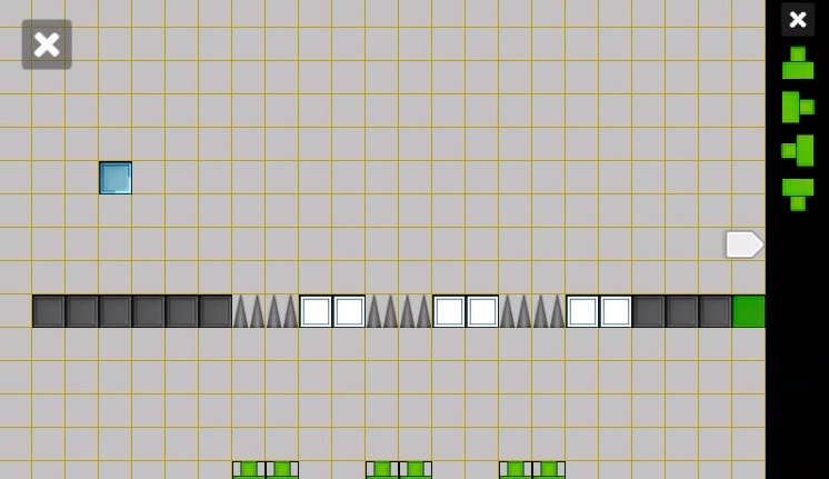
Although both WHP1 and WHP2’s tilemaps were saved using .txt file, we designed levels for WHP1 using just Notepad. On the other hand, I coded an in-game level editor for WHP2. It certainly made things A LOT easier, and allowed the team to be more creative. I highly suggest having a level editor before you even start designing levels.
Closing words
Don’t underestimate how long level designing takes! When I first started planning out the project, I wanted to have all 200 levels done in a couple of days. After all – I already had a level editor and it’d just be clicking a few buttons. Welp, it ended up taking over two months to get all levels to their current state. And I still can find levels that I can improve.