Typography: Modular Scale
> Published on March 1st 2016 • 505 words • 3 min read
I'm often asked by my design juniors, "How do you pick what font-size you give to your heading and paragraph elements?" The answer, like every other answer to design questions, is that it depends on the situation. For simple websites with not much textual content, some designers like to pick convenient sizes that they will often use. However, text heavy websites that actually do make use of all heading levels (h1 through h6), I recommend using a guideline known as the modular scale, a systematic and mathematical way of design.
This term was first publicly used by Robert Bringhurst in his book Elements of Typographic Style. He writes:
A modular scale, like a musical scale, is a prearranged set of harmonious proportions.
Robert Bringhurst
This is a short and very concise description. The keyword is harmonious proportions. Harmonious proportions can be thought of as having a consistent ratio through your design.
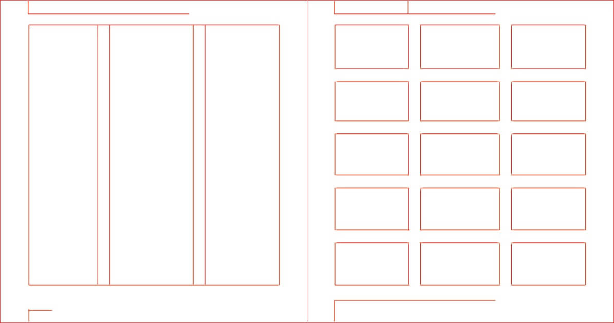
) Modular __scale__ in <strong>hi</strong> action ([Credit: Ian Rose](http://www.slideshare.net/iancrose/vertical-rhythm-and-modular-scale-typesettings))](/static/c1f58f76475fe0bd1ed842a966e0c1d0/e4b0b/modular-mockup.jpg)
This is very useful in typography and as shown in the above image. Not only does it greatly simplifies the process of choosing font-size, it also creates consistency and pattern for the end-user. One other usage I found of employing a modular scale is that it makes responsive web design a lot easier. Since the size of each of your headings is relative to each other, simply reducing the ratio exponent by 1 for all headings will keep the layout and appearance constant while taking up overall less space (for mobile).

Choosing Your Modular Scale
There are two components to the modular scale:
- The base. This is the starting root number. It usually is the size that you want the paragraph text to be.
- The scale. The scale is how much the
font-sizechanges per heading level.
To find the perfect modular scale for your typographic design, you must do lots of experimenting. There is no right or wrong answer in design. Luckily, there are many tools to help you pick between the different base and scale options.

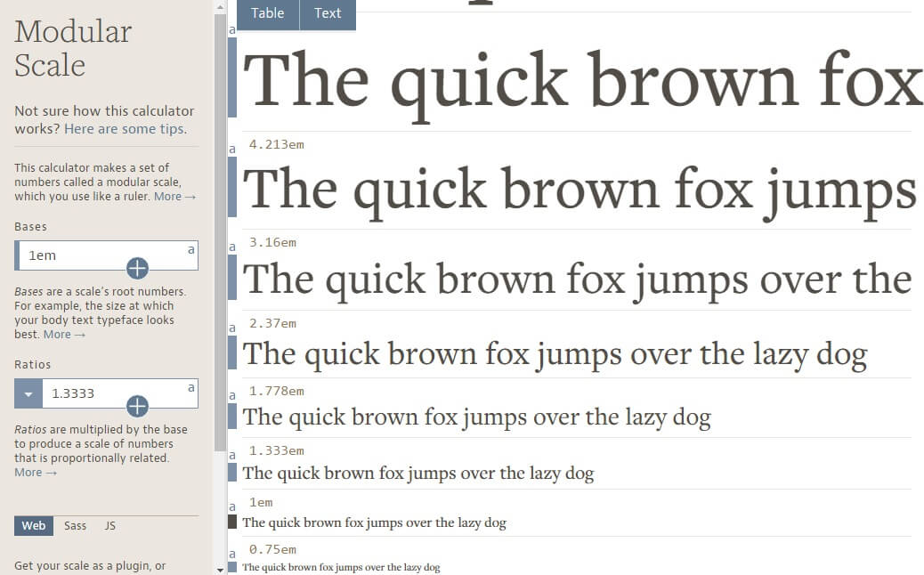
Once you have decided on a base and scale combination, implementing it in your website is a piece of cake. Simply paste the generated CSS code from the tools into your spreadsheet. Here is a sample one for 1em base * 1.333 scale:
html {font-size: 1em;}body {background-color: white;font-family: "Libre Baskerville", serif;font-weight: 400;line-height: 1.45;color: #333;}p {margin-bottom: 1.3em;}h1,h2,h3,h4 {margin: 1.414em 0 0.5em;font-weight: inherit;line-height: 1.2;}h1 {margin-top: 0;font-size: 3.998em;}h2 {font-size: 2.827em;}h3 {font-size: 1.999em;}h4 {font-size: 1.414em;}small,.font_small {font-size: 0.707em;}
Save and refresh. Enjoy your new, beautiful, typographic design!